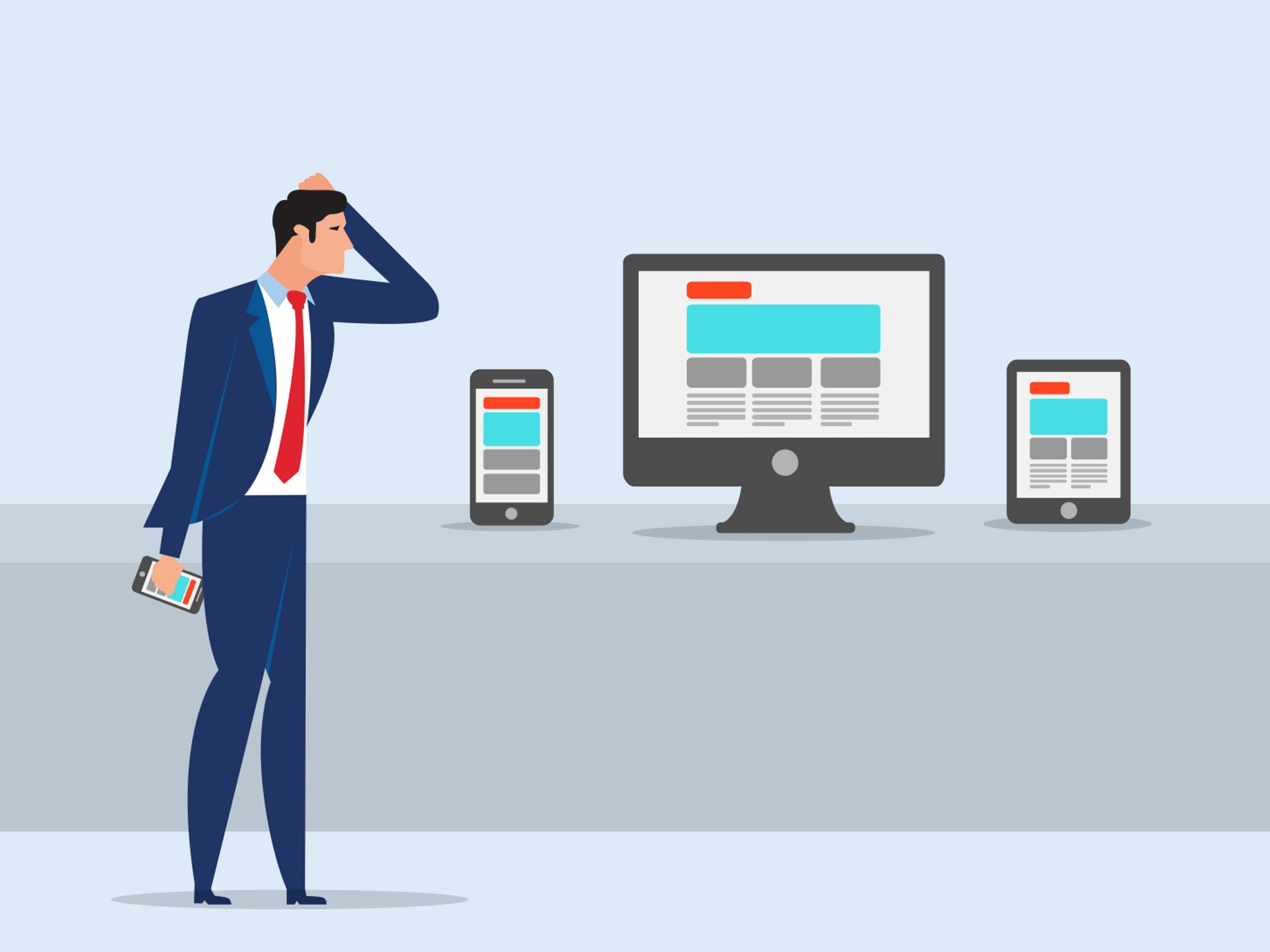
Desktop Vs. Mobile App Design

The mobile app design has become increasingly important over the years as mobile smartphones’ popularity has increased. The considerations that need to be made for mobile app design are different from that of the desktop alternative.
As smartphones become more powerful and people start using them even more than they currently do to perform complex tasks, designs created initially for desktops need to adapt for mobile. This goes beyond having to account for a smaller screen.
This article will talk about desktop design vs. mobile app design, the different ways users interact with the two platforms, and how these differences can be used to create better designs that cater to both platforms.
Focusing on both mobile and desktop can be difficult because of the big differences between them. To make the process easier, you should hire a mobile app design company to take most of your shoulders’ weight.
Touchable Vs. Clickable Interactions
Since mobile apps require the user to use a touchscreen, they incorporate the design fundamentally different from desktops that use a cursor to click and interact with the website/web app.
Cursors are a lot more accurate than the touchscreen, so many different needs need to be accommodated to make both the mobile and desktop user experience great. The main issue that people encounter is links, buttons, and similar elements being too small. These need to be enlarged and have enough space between them to interact with users on mobile easily.
Screen Size
Mobile screens are small and can only display a certain amount of content and elements. So thought needs to be put into what content is the most important and should communicate over everything else. One main difference that can be seen between mobile and desktop designs is the navigation. Mobile plans tend to use a hamburger menu/dropdown menu, while desktops can have a fixed navigation bar.
Mobile designs tend to have a heavier focus on minimalism as it is more of a necessity to use the small amount of screen space available. Desktop designs have incorporated design choices such as hamburger menus, but this is more stylistic as there is more than enough screen space open for them not to be needed.
Organization Of Content
Scrolling is used to display all the content on mobile devices instead of the column layout on desktops. The column layout for desktops lets designers have more freedom to express their creativity because of all the available space. However, scrolling isn’t a bad thing either, and it’s not like you don’t need to scroll on desktops. There’s just more of it on mobile.
The way content is displayed and organized is a major consideration that needs to be made when designing for mobile. Responsive designs are often used to accommodate the various screen sizes available.
Another essential thing to keep in mind is that desktops are almost always landscape. At the same time, mobile can view content in both landscape and portrait. This is both good and bad. On the one hand, this allows for more functionality, but it requires a lot more design work.
Best Design Practises For Desktop And Mobile
Designing with both mobile and desktop can be difficult, and this is made more complicated depending on the type of content displayed. If you want to make this process easier, keep reading to learn how to optimize this process and design it better for mobile and desktop.
Requesting help from a mobile app design agency will make the design process so much easier and will result in a more outstanding design for both mobile and desktop. Rushing the design for either platform will cause a bad user experience, which needs to be avoided. So ask for help if you need it. Hire one of the many mobile app design services in the market that provide the services you are looking for.
Always Design For Mobile Before Desktop
If you need to design for both mobile and desktop, then always design for mobile-first. Once you have finished the mobile design, you will have a much easier time when it comes to desktop design. You will have more space to work with, you can add more elements, and the screen size will not limit you.
Understand The User’s Intent
When users are on the mobile looking for content, they don’t want to spend prolonged amounts of time looking for what they need. They want the experience to be quick and easy. When designing for mobile, this intent needs to be remembered. Content should be easy to read on mobile; the spacing between elements needs to be considered wise to make readability fast and easy.
Someone viewing the same content on a desktop will have a different mindset, and likely won’t be in as much of a rush. While this may not always be true, it is typically the case. There are many things that designers need to keep in mind, and intent is one of them. You need to understand your users.
Remember That Users interact With Both The Desktop and Mobile Design
Rarely does a user only use the mobile version of an application or only the desktop version. People like the ease of use; they want to get what they want quickly and easily. This means they will use both the mobile and desktop versions to access the content wherever they are.
Don’t focus on just creating a great mobile experience for users or just a great desktop experience. Just create a great user experience. No matter what device people use, they should be greeted with a great UI and have a simple, convenient, and fast experience.
Remember that there is a difference between designing an app for a mobile device and adapting a desktop application for mobile. One is built from the ground up to cater to the mobile platform, and the other one is just thrown together quickly and isn’t optimized for mobile use. Designing an app from the ground up for mobile can be difficult if the desktop version already exists, so you should ask one of the many mobile app firms to help you keep the design consistent across the board and make the development process more comfortable.
